
목록개발 Web/HTML & CSS (75)
음악, 삶, 개발
 CSS 의 linear-gradient 의 다양한 예제들
developer.mozilla.org/en-US/docs/Web/CSS/linear-gradient() 아래 > #g { background: linear-gradient(red, blue); }

 요소의 일부분 잘라내기 : CSS 의 clip-path 속성
developer.mozilla.org/ko/docs/Web/CSS/clip-path stackoverflow.com/questions/7324722/cut-corners-using-css https://css-tricks.com/almanac/properties/c/clip-path/ codepen.io/stoumann/pen/abZxoOM css-tricks.com/animating-with-clip-path/ CSS 의 clip-path 속성을 정의하게되면, 요소의 일부분을 잘라낼수있다. div { clip-path : polygon(0 0, 0 100%, 100% 100%, 100% 55%, 55% 0); } 이 clip-path 로 잘린 부분은 당연히 event 리스너가 작동하..
 뉴모티즘 (neumorphism) 버튼
https://designshack.net/articles/css/12-fun-css-text-shadows-you-can-copy-and-paste/ https://neumorphism.io/#ffffff https://codepen.io/sdthornton/pen/wBZdXq https://gist.github.com/teddykishi/3eba129cc0fc7d7cbdce02aabfbc8858 .button { width : 300px; height : 300px; border-radius : 20px; background : #171717; box-shadow : -1px -1px 4px rgb(60, 60, 60), 8px 8px 8px rgb(10, 10, 10); /* te..
 div 로 button 만들기 : CSS 의 :active 속성
button 태그를 사용하지않고도 div 로도 button 을 만들수있다. :active 클래스를 추가하게되면, 마우스가 눌렸을때 일어날 변화를 설정할수있다. .rect { background-color: red; } /* mouse 가 눌렸을때 */ .rect:active { background-color: green; }
 CSS 의 box-shadow 속성
developer.mozilla.org/ko/docs/Web/CSS/box-shadow CSS 의 box-shaow 속성은 해당 요소의 하단 레이어를 만들어주는 속성이다. box-shadow 의 값으로는 5가지가 들어갈수있다. .rect { background-color: red; box-shadow: 50px /* x */ 10px /* y */ 0px /* blur */ 0px /* spread */ blue; /* color */ } 반드시 위의 값 순서를 맞춰야한다. x, y, blur, spread, color 순이다. 여기서, 값의 가장 앞에 inset 을 추가하게되면 inner layer 가 된다. .rect { box-shadow: inset 50px /* x */ 10p..
 Grid 아이템들의 상-하-좌-우-사이 간격 유지하기 : padding, margin
stackoverflow.com/questions/20626685/better-way-to-set-distance-between-flexbox-items?page=1&tab=votes#tab-top #parent { position : absolute; width : 500px; height : 500px; background-color: tomato; display : grid; grid-auto-flow : column; padding : 10px; /* 나와 자식간에 10px 의 gap 을 만들어줘! */ box-sizing : border-box; /* 하지만..날 늘리지말고, 자식을 10px 줄여줘! */ } #child { background-color: green; marg..
 padding 하면서 크기 유지하기 : box-sizing 속성
padding 속성은 부모와 자식간에 간격을 의미한다. 이때 이 간격은 상,하,좌,우 모두이다. #parent { width : 500px; height : 500px; padding : 20px; } padding 속성은 margin 과 달리, 부모 css 에서 정의되어야한다. padding 의 디폴트는, 값에 따라 부모의 크기를 늘린다. 따라서 위와 같이, 500px 500px 에, padding 이 20px 이라면 부모의 크기는 540px 540px 이 된다. 40px 이 늘어나는 이유는, 상.하 그리고 좌.우 (20px x 2 ) 이기때문이다. 하지만 부모의 크기를 유지한채, 자식의 크기를 줄여주는 속성이 있는데, 바로 box-sizing 의 border-box 이다. #parent { width..
 margin 속성은 event 범위를 줄인다.
div { margin : 10px; } margin 속성은 위와 같이, 실제 이벤트가 작동하는 범위를 줄인다. 즉, 해당 요소의 크기가 실제로 줄어든다. 하지만, margin 영역에도 마우스 이벤트가 발생했으면 할수있다. 이럴때는 inline border 를 만들어 marigin 처럼 보이게끔 할수있다. div { box-sizing : border-box; border : 12px solid black; } 이벤트가 margin 영역 (실제로는 border 영역) 에도 발생한다.
 div 들을 넣을 책꽂이 만들기 : grid-auto-flow 속성
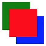
#container { position : absolute; width : 200px; height : 200px; background-color : rgb(10, 10, 10); display : grid; grid-auto-flow : column; /* 책꽂이 */ } #one { background-color: red; } #two { background-color: green; } #three { background-color: blue; } #four { background-color: yellow; }