
음악, 삶, 개발
LeeButton.vue 본문
< 참고 자료 >
v3.vuejs.org/guide/class-and-style.html
여기저기 손봐야할곳이 꽤나 있지만, 근사한걸 만든것같은 기분이다.
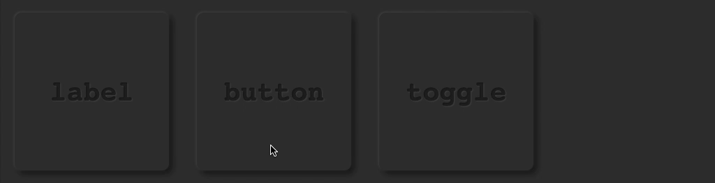
하나의 컴포넌트로 사용자가 던지는 props 에 따라,
라벨, 버튼, 토글 버튼 3가지의 모습을 가질수있다.
<!-- App.vue -->

<lee-button type="label" />
<lee-button type="once" />
<lee-button type="toggle"/>
<!-- LeeButton.vue -->
<template>
<div
class="lee-button-box"
:style="css"
>
<div
class ="lee-button"
:class ="state.className"
:style ="css"
v-text ="buttonText"
v-on:[state.eventName] ="toggleActive"
></div>
</div>
</template>
<script>
import { reactive, computed } from 'vue'
import Color from 'color'
export default {
props : {
type : { type : String, default : 'toggle' /* lable, once, toggle */},
padding : { type : Number, default : 20},
colorBackground : { type : String, default : 'rgb(50, 50, 50)'},
fontSize : { type : Number, default : 40},
buttonRound : { type : Number, default : 10},
buttonText : { type : String, default : 'Click!'},
},
setup(props) {
const state = reactive({
isPressed : false,
eventName : props.type === 'toggle' ? 'mousedown' : null,
className : {
'lee-button-once' : props.type === 'once',
'lee-button-toggle' : computed(() => state.isPressed)
}
})
const css = {
'--padding' : props.padding + 'px',
'--color-background' : props.colorBackground,
'--color-button-on' : Color(props.colorBackground).darken(0.05),
'--font-size-off' : props.fontSize + 'px',
'--font-size-on' : props.fontSize - 3 + 'px',
'--button-round' : props.buttonRound + 'px',
}
function toggleActive() {
state.isPressed = !state.isPressed
}
return { state, css, toggleActive }
}
}
</script>
<style scoped>
.lee-button-box {
user-select : none; /* prevent dragging text */
width : 100%;
height : 100%;
box-sizing : border-box;
padding : var(--padding);
background-color : var(--color-background);
}
.lee-button {
width : 100%;
height : 100%;
font-family : Courier, monospace;
font-weight : bolder;
/* Align text as center */
display : flex;
justify-content : center;
align-items : center;
font-size : var(--font-size-off);
border-radius : var(--button-round);
/* shadow for button off */
box-shadow :
-1px -1px 4px rgba(100, 100, 100,0.5),
5px 5px 8px rgba(0, 0, 0, 0.5);
/* shadow for text off */
color : rgba(0,0,0, 0.55);
text-shadow : 1px 1px 2px rgba(255,255,255, 0.1);
}
.lee-button-once:active, .lee-button-toggle {
background-color : var(--color-button-on);
font-size : var(--font-size-on);
/* shadow for button on */
box-shadow :
inset -1px -1px 4px rgba(60, 60, 60,0.5),
inset 5px 5px 5px rgba(0, 0, 0, 0.5);
}
</style>내부적으로 변수명이나 함수명의 변경이 조금 필요할것같다.
또한 버튼 type 이 label 인 경우 조금 구분되는 css 가 필요할것같다.
정말 많은것을 배웠다.
1. 다이나믹 event 바인딩
v-on:[state.eventName] ="toggleActive"이게 필요한 이유는, 버튼 타입이 label 이거나 one 인 경우,
이벤트 리스너가 필요없기때문이다. 이때는 [ ] 안에 null 을 던지면 이벤트 리스너가 등록되지않는다.
2. 다이나믹 클래스명 바인딩
:class ="state.className"이게 필요한 이유는, 버튼의 type, 즉 사용자가 어떤 props 를
넘겼냐에 따라 보여주는 css 가 달라질 필요가 있기떄문이다.
예를 들어, 버튼 type 이 once 인 경우는,
마우스를 눌렀을때 일시적으로 버튼이 들어갔다가 바로 나와야하기때문에,
css 의 :active 클래스로 구현이 가능하지만,
type 이 toggle 인 경우에는 마우스 클릭을 확인해야하기때문이다.
현재 마우스가 클릭된 상태에 따라 class 이름이 변경되야하는것이다.
'개발 Web/Vue.js 공부방' Related Articles
more


